

Greatness, at least in terms of aircraft, is a many-faceted and somewhat intangible quality. However, whether born great or having greatness thrust upon them, most great aircraft do share one common trait, and that’s variation. If a plane is great, there are likely to be many different versions, each representing a new evolution designed to keep said aircraft at the forefront of its chosen vocation. Sure, there are some awesome one-trick ponies (the die-hard A-10 being a great example), but by and large, a successful and long-serving airplane will go through all kinds of changes.
One such airplane that needs no real introduction is the Spitfire. Sir Reginald Mitchell’s quintessentially British fighter was a thoroughbred from the start. Derived from lessons gleaned from the victorious S.6B air racer, the Spitfire evolved from a graceful and lithe greyhound of a fighter/interceptor into a variety of other forms and roles, including reconnaissance, ground attack and trainer. It was developed and evolved to operate from ships as the Seafire, and there were even a couple of different floatplane variants!
However, one of the most radical changes to the classic Spitfire came with the adoption of the clipped “Low Flight” wing. This truncated the Spit’s graceful trademark wing planform to improve handling and speed at low level, and while effective, it did result in an aircraft that is not as widely appreciated for its functional aesthetic as its forebear. Another major change was the introduction of a bubble canopy on some variants, resulting in a very different profile, one that, at least to me, made it look even racier than before. Perhaps one of the weirder variants then was the LF.XVI, which was based on the Mk. IX. It had both the stumpy “LF” wings and the bubble top, making it a weird departure from the classic Spit in almost every respect.
Another British classic that needs no introduction to modellers (at least to those who read this website) is Matchbox. Matchbox airplane kits, unlike the Spit, were not thoroughbreds. They were bred for simplicity and ease of construction (and purchasing, of course), and as such don’t have the same level of detail or finesse as a lot of their contemporaries. What they did have, though, was a large stable of interesting subjects that were quite accurate in outline, even if low on detail. For a good example of this, you can check out my Matchbox Mega Score or just scan through the Out of Box reviews.
Matchbox tried to do subjects that others didn’t do, although they also had to make money, so needed some “Bank” kits. These are kits that companies know will sell. They’re the classics that everyone has to make to be taken seriously. For every Buffalo and Seafox, there was a Mustang and a Corsair. (Notice I don’t have those ones!) Unsurprisingly, there was also a Spitfire, the Mk. IX. However, as Matchbox evolved, it found it necessary to change the forms of some of its kits to keep up with demand and service different modelling requirements. Thus, in the later stages of the company’s life, a lot of kits were produced in new variants. Many were transformed into two seaters (like the Lightning, Viggen and Hunter), while others became “2-in-1” kits, able to build the original kit, or a new variant.
A perfect example of this was the “new” Spitfire IX/XVI. Taking a cue from real life, Matchbox developed the “classic” Mk. IX into the bubble-topped, clipped-wing Mk. XVI. This meant changes to the fuselage and wings, as well as including two cockpit canopies and new decals. Of course, being an oddball, the XVI is the model I was attracted to. In fact, I was so attracted to this one that I started working on it straight away!
Building the LF.XVI:
As this is a fairly typical Matchbox “Purple Range” kit, it’s very small and has a relatively low piece count. Most of the kit is the Mk. IX, but somehow they managed to shoehorn in a second canopy, different wing tips and, of course, a new spine for the rear fuselage. As this kit came from the time when Revell Germany owned the Matchbox name, the moulds for the XVI are fairly tired, and the few raised lines were weak and the few recessed lines were… canyon-like.
One thing this kit doesn’t waste time on is the cockpit. You get a seat. That’s all. Oh, and a pilot, but I never use figures. So, if you want a super-duper replica, you can scratchbuild everything, or get a resin cockpit. Or, you can do it my way, which is to paint the cockpit area in Model Master Acrylic (MMA) RAF Interior Green, give it a wash of Citadel Nuln Oil and then scrape it up a bit with some silver pencil crayon. The addition of some seatbelts made from masking tape will bring the cockpit up to the barest minimum of 1970’s acceptability. That’s all I did; you can’t see much through the thick cockpit canopy anyway, so why bother? You want detail, buy a Hasegawa. You want quick and dirty, you go with a Matchbox!
Before joining the fuselage, though, it’s necessary to cut down the standard “razorback”. Interestingly, the moulds were altered for this purpose, and there are cut lines on the inside of the fuselage. Taking a razor saw along these lines results in a definitely “chopped down” appearance, and allows you to fit on the new spine. I used some thin sheet styrene to add some locating tabs to improve the location of this piece, which did fit on surprisingly well. One nod to detail was to drill out the three “lightening holes” in the fillet behind the headrest. You still can barely see it, but it was a fun use for my tiny drill set!

I did rescribe all the raised detail (and the recessed detail as well) so that the entire kit would be consistent with more modern models I’ve built. This was quite an exercise despite the small number of panel lines; there was a lot of clean-up needed on the underside of the wings! Once the new spine was on and the wings attached, the “putty wars” could begin in earnest. No lie; this thing needs a lot of work.

Oddly, the new spine is not symmetric, and this makes filling in the join lines interesting. It’s also necessary to rescribe the port-side hatch into the new fairing, as well as to fair it all nicely into the existing fuselage. I used a lot of Tamiya putty, with coats of MMA Flat White over top. I used the Flat White for filling in etching mistakes as well. There was plenty of sanding, and getting that new spine to look like it was supposed to be there was not easy. Lots of putty and Flat White later, though, and I had the machine looking more or less like a Mk. XVI!
The wing/fuselage joint was, predictably, not very good. Again, lots of putty and sanding. One other place that needed a lot of filling was, surprisingly, out near the wingtips. The wing skins “collapsed” near the tips, for no apparent reason, and some filling was needed to bring the area level with the rest of the wing. As mentioned in the OOB Review, the cannon barrels aren’t very good looking, and they don’t fit very well. So, a lot of glue-melting later and I had them secure. The tailplanes went on pretty well, and fitting up the undernose intake was also surprisingly non-horrible.

One thing that was horrible was the fit of the bubble canopy. It barely joined the fuselage at all, and was too wide, too high, too… wrong. In order to make it fit on, I had to mould a new collar for it out of Aves Apoxie Sculp, and then try my best to fair this in. I will admit that it does make the plane look a bit odd, especially at the back of the canopy, but at least the canopy fit on and matched up to it when all was said and done, and that’s a far cry better than how it started! Thanks, Matchbox…


Painting:
Whereas you often get a choice of widely varying paints with a Matchbox kit, this one is different. Whether you chose the Mk. IX or XVI, the plane is in the typical late-war Dark Grey/Dark Green. I used MMA Dark Green for the green, and F-15 Grey for the grey parts. This is a bit purplish, and it looks just about right. I used Light Ghost Grey for the underside, and British Sky for the spinner.
The cool thing is that this plane, named “Winston Churchill” still exists! There are videos of it being started after restoration. Part of Kermit Weeks’ collection, this particular Mk. XVI can be seen on YouTube, which made painting a bit easier. For some reason, Mr. Weeks’ Spit has the yellow leading edges on the lower half of the wing, but those aren’t shown on the paint plan on the box’s back. In addition, the markings are quite different, but more on that later.
I sprayed the green first; I know from experience that MMA greens use HUGE pigments and generate a lot of overspray. I figured it’d be easier to do the grey after. I was originally going to airbrush the paint freehand, like my Defiant. However, it didn’t seem to want to work. I don’t know what the deal was; either my airbrush needle was bad, or the paint was too thick still… it just failed miserably. So, I went old-school, and just hard-painted the cammo by hand. I drew on the pattern I wanted with a pencil, and then painted over it.
It may sound a bit ghetto, but that approach has worked for me before. Numerous times, actually, I’ve done this and once you touch it up and airbrush on a final satin coat, it’s very hard to tell a good hand brushed job from a hard-masked airbrush paintjob. Sure, there’s a bit more sanding involved, but it’s a Matchbox; you have to expect that! In fact, with the paint on, I applied a couple coats of AquaGloss and then sanded them smooth-ish. I repeated this a couple of times, removing high spots and getting a nice glossy finish for decalling.

Decalling and Finishing:
I generally love Matchbox decals. They go on well, are thick and tough, but conform to most surfaces very well with only a bit of Future for decal softening, These, however… these AREN’T Matchbox decals. These are Revell Germany decals… from the early 1990s. Is this bad? Well, let me ask you, dear reader, this instead: Would you rather toast marshmallows around a campfire or be doused in gas and thrown into said fire? Right.
If you chose to burn, then you’d love the Revell Germany decals. However, for the rest of us, they are the WRONG ANSWER. They are total crap; utter and unconscionable blights in the history of model making. They are thick, but weak. They don’t conform to ANY surface even in the presence of Future or other decal solvents (Micro Sol did nothing to them). They are MATTE, which means they are prone to silvering, and the want to fragment if you try to pencil over them, even when they’re covered in Future!

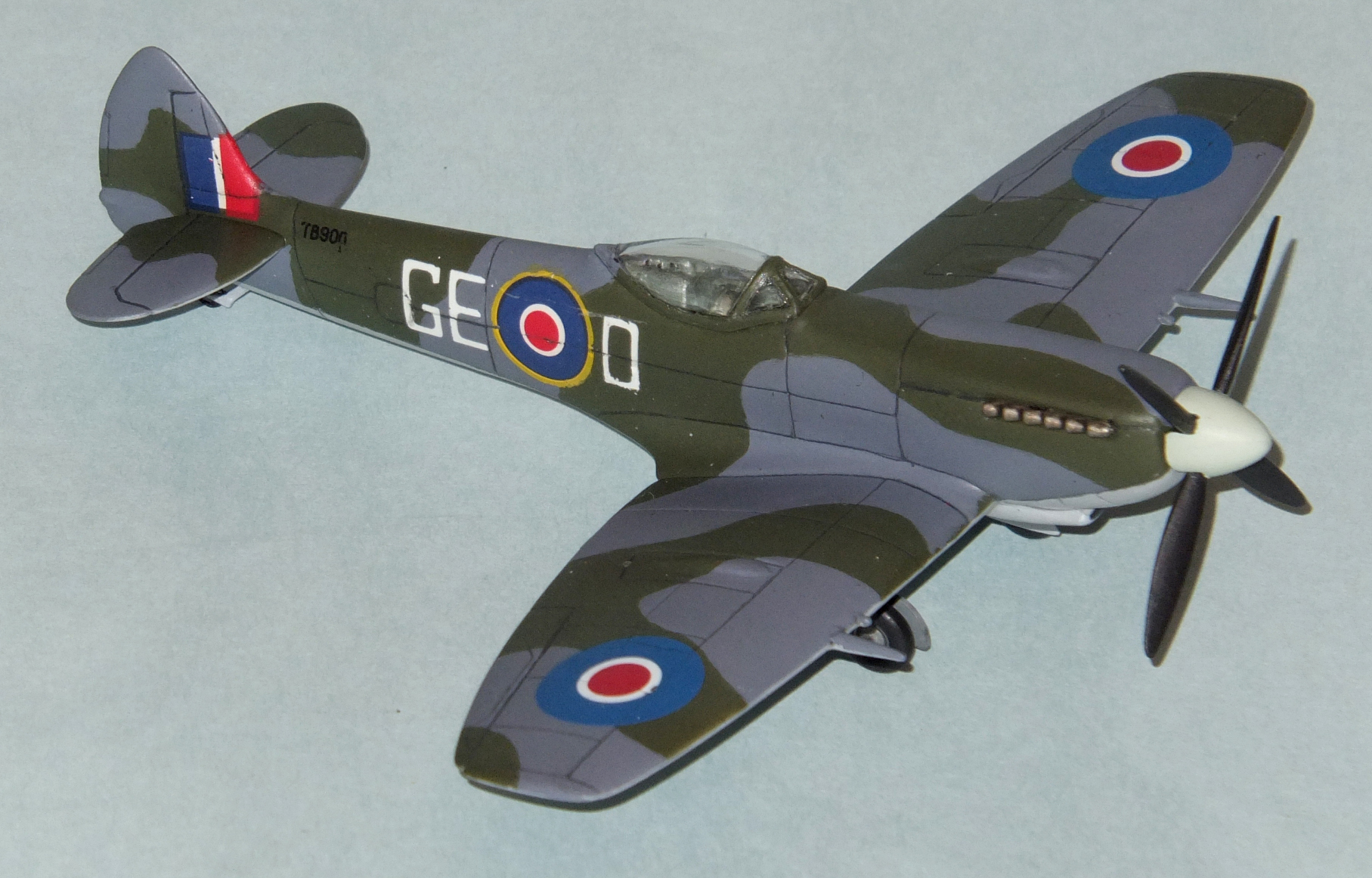
If bad decals were a disease, these would be “gonnasyphaherpaclap”, a wonderful term coined by my millwright friend at work to describe something that is all forms of bad in one. (Thanks Max!) The only saving grace is that most of the decals that come with the kit are wrong, or at least don’t match Kermit Weeks’ airplane. The worst offenders are the roundels. I know that there are all kinds of type names for British roundels, and they’re as confusing to me as Luftwaffe markings. However, I’m really not that much into caring about the minutiae of it all. However, using the kind of roundel with the yellow surround on the tops of the wings seems wrong.

On the paint plan, this is what’s shown. As expected, though, Mr. Weeks’ plane has a different type, one that looks more like the decals on my Spitfire F.22, namely a very late-war or early post-war type. Sadly, this is not a decal I have a lot of. Mercifully, though, I had ONE set from a kit that I used an alternate paint scheme on, and so I was able to get my hands on roundels that were at least close to right. These decals came from an RS Models kit, and they went on like a dream compared to the letter codes and roundels on the fuselage.

Yes, I had to use the D – GE codes as given by the kit. They are correct for this bird, and so I put on the port-side decals with much swearing and gnashing of teeth. They were as awful as I expected, if not worse, and it took a while to get them down, and minimize their propensity to silver at the drop of a hat. It was the starboard side that gave even more trouble, though. The decals are printed in “D – GE” order for both sides of the plane. While that’s right for the port side, if you just stick the starboard side decal on as is, you get a mess.
For, you see, either the roundels don’t line up when the letters do, or the opposite happens, and you end up with aligned roundels and letters that go too far forwards on the starboard side! Checking the video of this plane taxiing, though, solved the issue. On the plane at Kermit Weeks’ facility, the roundels line up and the “D” and “GE” are flipped. In other words, on the port you read it “D – GE” and on the starboard it’s “GE – D”. So, I had to cut the decal into four pieces to apply it. This meant 4x the fun of dealing with substandard Revell Germany decals. Great…

Not surprisingly, the fin flashes and serial numbers were no better. In fact, the fin flashes look terrible when you take photos of the plane. With the flash engaged, you can see there is a white patch under the colours, and so there’s a brighter centre with “semi-transparent” edges. Both the side call letters and fin flashes really knock the finished kit down a bit, in my view. I did a pretty good job on the model, over all, but these beyond-crappy decals tend to make it look more amateurish than it ought to, I feel.

I did all the panel lines with a filed down mechanical pencil, and I used a couple of heavy coats of Aqua Gloss to seal the decals. I then took my life in my hands and sanded this down lightly, twice! This integrated the decals as well as possible. I then used Delta Ceramcoat Urethane Indoor/Outdoor Varnish to matte-coat the entire plane. The same stuff, cut with Future, was then used to bring it back to a “low satin” finish. Sure, the real thing is shinier, but I do find shiny combat aircraft to look weird.


Conclusions:
The Spitfire proved itself from day one to be one of the greats. It was a fantastic fighter that proved it could be adapted to different roles and regimes, and it served with distinction in all major theatres of the war. Some versions helped to defend the nascent nation of Israel in 1948 and others even soldiered on into the Korean conflict. With performance and flexibility to match its stunning good looks, the Spitfire is an immortal in the pantheon of combat aircraft.
Sadly, the Matchbox Spitfire Mk. XVI is a bit closer to humility than greatness. It is everything a Matchbox usually is; both good and bad. It is a simple kit of an interesting variant of the Spit. It is relatively decent in terms of shape and it captures the essence of the odd clipped wing bubbletop Spit very well. However, it is very low on detail and isn’t a great model for those who are super-serious about their Spitfires.
This is a great, simple kit for a beginner or someone who wants to practice the basics. It was at birth, and still is, a “pocket money” kit. Sadly, what “pocket money” was before is no longer the case, and due to the “classic” nature of Matchbox kits, this one will likely cost a bit more than it should. Still, as a training project, or a “together” build between veteran and novice builder, the kit still has value.
Unfortunately, the basic soundness of the Matchbox design is watered-down by deceptively simple, but ultimately troublesome, re-engineering. Making the Mk. IX into the XVI requires skills that novice modellers just won’t have. Unless you really work at this thing, it isn’t going to look very good, and to top it off, the horrible cockpit fit can ruin even a decent build job.
Making matters worse, the steaming cow-flap of a decal sheet is a case of insult being added to injury, and is despicable. It really ruins the kit, and if you have this, I suggest you get yourself some aftermarket decals. Anything will be better than what comes with it. I call “Shame!” on Revell Germany for their undeniably appalling decal sheet. Hang your head and think about what you did, Revell. There cannot be forgiveness…
So, who is this kit for? Really, and I hate to say it, pretty much nobody. Nobody, that is, except for people like me. If you’re an experienced modeller, and you want to see what you can do with a chestnut, or you just want to get the retro-rush of building something like you did when you were a kid, then the Matchbox Spit is your answer. It was therapeutic and challenging all at once. I got mad, but it was a labour of love, and I got to build a kit I’d only just learned existed from a line for which I have a completely illogical and likely ill-conceived love.
I can’t recommend this kit to anyone but crazies like me. While it doesn’t look as good as other kits on the shelf, I know it could have turned out so much worse, except for my efforts to save it. This thing really is like Charlie Brown’s Christmas Tree; some love and attention are needed and will pay off, although you might be hard-pressed to tell just by looking.
Personally, this kit reminded me why I love Matchbox kits and yet why I don’t build them all the time. If you want to join the ranks of those afflicted with RMS (Retro Modelling Syndrome) then there’s really no better way to do it than with this, or a similar kit. You’ll laugh, you’ll cry, and you’ll fly it around your model table like you’re 10 again. What else do you want?

